Hello!! This week has been a hell of a week because I have a musical that I am in and I have been staying late at school performing. Because of this, I haven't been able to film school shots as I hoped. But! I am going to the beach this Saturday to film the shots that I need there so YAY! My next blog post will be about that, but because I don't have anything related to production at the moment, I will talk about the print component of my project, and just flip my two last blog posts for the week.
Today in class we were taught a lesson about the print component of our project. Here are key things that I noted:
-The print component for the film option is supposed to be a poster for the film
-The main key art should be shown
-If the film is theoretically going to be a theatrical release, you should include: Title, Keyart, Production credits, and tagline
-If the film is theoretically going to be a streaming release, you should include: multiple thumbnails with key art, title, and no credits
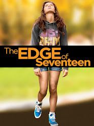
Keeping this in mind, let's look at some other film posters from coming of age movies and see what I like.
Okay so one thing that is very apparent with all of these posters is that the protagonist(s) are clearly shown in the poster. This is something that I also intend to do because the entire story revolves around Blake, Bea, and Quinn, so the poster should definitely center around them as well. These posters also follow a specific color scheme that is significant to the film. Because I haven't really started filming yet, I am not 100% what my color scheme will look like, but I do want to have cooler tones throughout most of the film, except at the very end of the second trailer where Blake is facing fire, to create a juxtaposition.
Let me look for a font that I might like using Canva (the love of my life)
So I made this, obviously I can't use it because I am in it, but I like the concept of it being the three girls taking a picture in the mirror because that establishes the filming part of the story while also showing the protagonists. I don't like the background I used (I just blurred the background from the picture) so I would have to experiment with what I would do, but I like this font, I would have to add credits and all of that stuff if I am doing a theatrical release but, using this as a little sample is helpful, because I have an idea for what I might want to do. I also might want to create two film posters (for fun), one with the three girls like this, and one with just Blake. Putting that aside, I am happy that I have a good idea of what I want to do. See you soon for some fun production stuff!!!


.png)
No comments:
Post a Comment